10.01.2023 - 20.01.2023 (Week 1 - Week 2)
Vishmitha Krisna Kumar (0360488)
Design Principles / Bachelors of Fashion Design Technology.
EXERCISE 1
During Week 1 lecture, tutorial and practical classes, we were able to dive into the various design principles which include, gestalt theory, contrast, emphasis, balance, repetition, movement, harmony & unity, symbol and lastly word & image.
TASK :
In this exercise, we are required to choose 2 design principles and create a design for each principle respectively. I have chosen Gestalt Theory and Balance.
1. GESTALT THEORY
'Gestalt' refers to a shape or form in German. Gestalt principles or laws are rules that describe how the human eye perceives visual elements. It aims to show how complex images can be reduced to more simple shapes.
1.1 Visual references
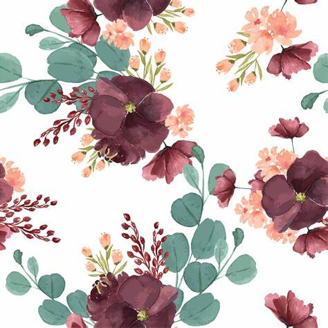
I have always been playing around with floral designs as it seems like an elegant and simple design. The Principle of Repetition is also taking place here in the picture.
The idea of a magazine cover themed design has always been in my mind so, this is when I decided to imply this concept onto my design.
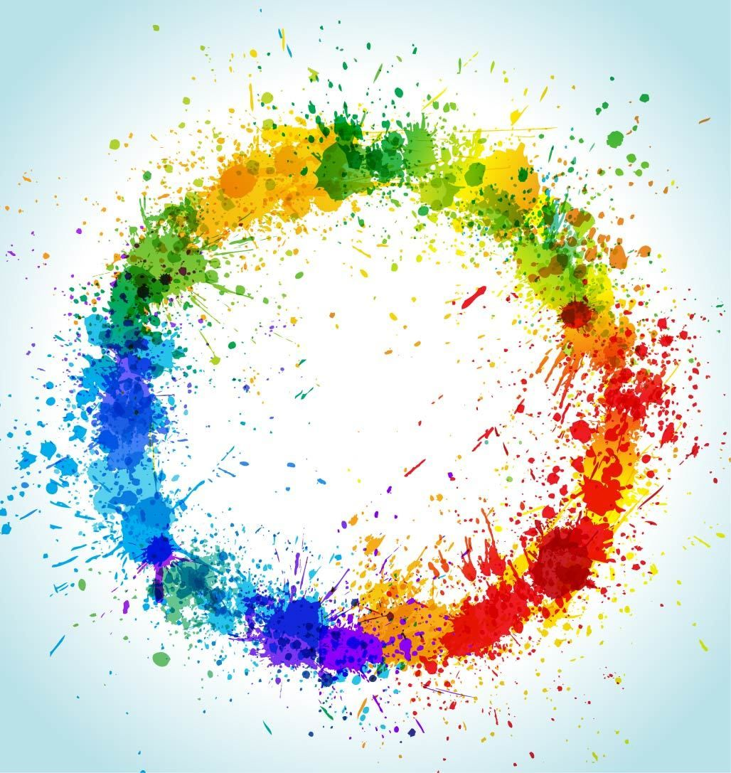
A splash of vibrant colors could always uplift a design. But overexerting it on a design could also lead to a problem. It should be executed in the right way. The use of vibrant colors could attract attention from viewers.
1.2 Idea exploration
Figure 1.2.1
The figure shows a rough sketch of a model that I initially wanted to use for my design. I wanted a more confident concept so I didn't go for this sketch.
Figure 1.2.2
The figure above shows the image that I wanted to portray which is confidence. The design is still lacking in many ways as it was too simple.
Figure 1.2.3
Included a bold wording "LOVE" to better express my drawing. I had also wanted the design to look more feminine hence, I added the floral patterns with bubble borders.
1.3 Feedback
Referring to Figure 1.2.3, I had received some feedback from Ms. Yip Jinchi. I was advised to remove the borders as it was too much going on and use bright colors for the design.
Figure 1.3.1
On the 18th of January, I had asked Ms. Yip Jinchi for advice regarding the color of the background and the wordings. She recommended that I used a bright color for the wordings and leave the background white as the color that I had initially chosen for the background would blend in with the flowers.
1.4 Final Design
Figure 1.4.1
This is the final product of my design. I had incorporated neutral colors to the design as it would be pleasing to the eyes.
2. BALANCE
Balance refers to the distribution of visual weight in a work of design. It is the visual equilibrium of the elements that causes the total image to appear balanced. Balance can be symmetrical or asymmetrical.
2.1 Visual references
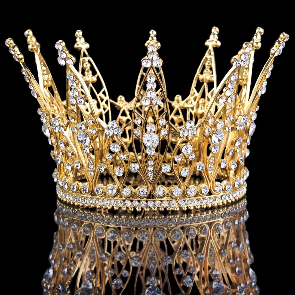
The image above shows a beautiful crown. I decided to use a crown because it's something that influences everybody. In my opinion, it represents a leader.
The image above is the 'ying and yang'. Shows a good balance in good and bad.
The image above shows complete opposites signs which is the day and night.
Represents purity and innocence.
Represents evil or bad intentions.
2.2 Idea Exploration
Figure 2.2.1
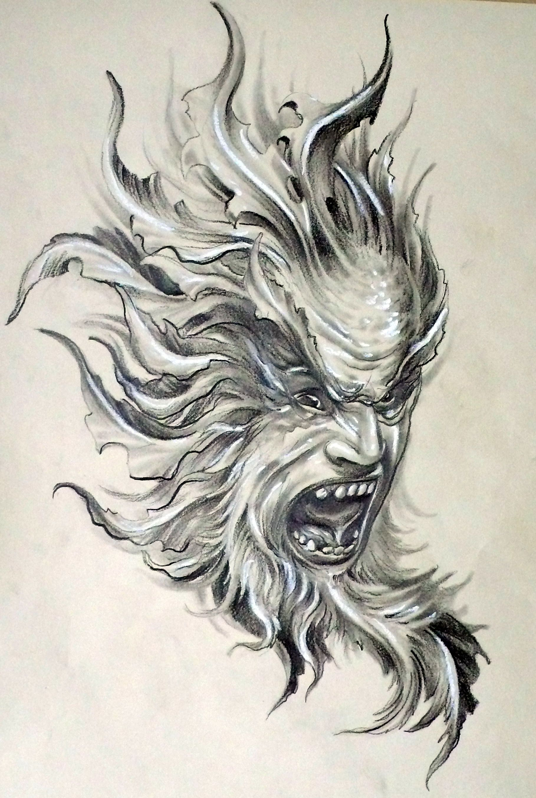
This shows a rough sketch of my design. The flame like design represents evil or bad intentions.
Figure 2.2.2
I had decided to add a balance and added the flowers for purity.
2.3 Feeback
Figure 2.2.2
Referring to the figure above, Ms. Yip Jinchi had advised me to show more of a balance to my design. So, she suggested to spread the design to the corners of the page so that it would have more balance.
Figure 2.3.1
This is the final sketch after receiving the feedback.
2.4 Final Design
Figure 2.4.1
This is my final design. I had included vibrant colors to bring out the design more while still keeping the balance. The design has two different sides to show that both of it balances each other out.
REFLECTION
Through this exercise, I had learnt the different design principles which include, gestalt theory, contrast, emphasis, balance, repetition, movement, harmony & unity, symbol and lastly word & image. I find it all interesting and intriguing. I also learnt to color match my designs which I still am lacking in. I will work on it and improve further to apply it on my designs in the future. The designs that I made reflects a youthful and lively atmosphere which I hope can be conveyed to the viewers. Besides that, I had learnt many things from seeing my peer's different and imaginative designs such as the way they made their designs by using technology and their implication of different techniques to add colors. In conclusion, this experience has helped me in many aspects to improve my thought process while making my designs.


.jpeg)


.jpeg)


Comments
Post a Comment