INTERCULTURAL DESIGN ACADEMIC BLOG
Project 1: PROPOSAL
On our first class leture for intercultural design, we held an online meeting. We were roughly briefed on our programme structure and the Module Information Booklet (MIB). We were given the task to create a proposal revolving on the theme of "Cultural Sensitivity in Design". This is a very general theme which could be covered in different aspects.
However, as we were divided into teams of 6 members that were given the opportuinity to carry out this study in Japan. Hence, our design topic had to be cultural sensitivity specified in Japan. Without wasting any time, we had a meeting outside our class and brainstormed ideas. These are the 3 main ideas that we had come up with:
1. Tattoo Culture in Japan
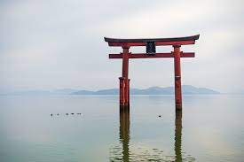
2. Torii Gates
3. Yami Kawaii Aesthetic.
Tattoo
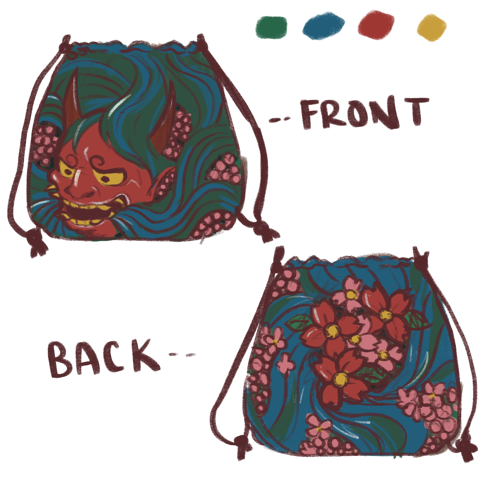
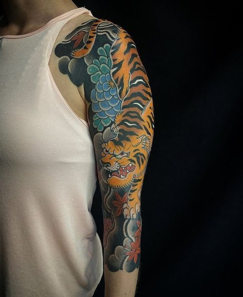
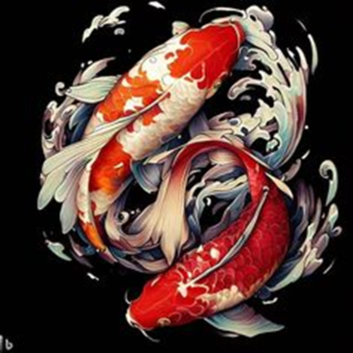
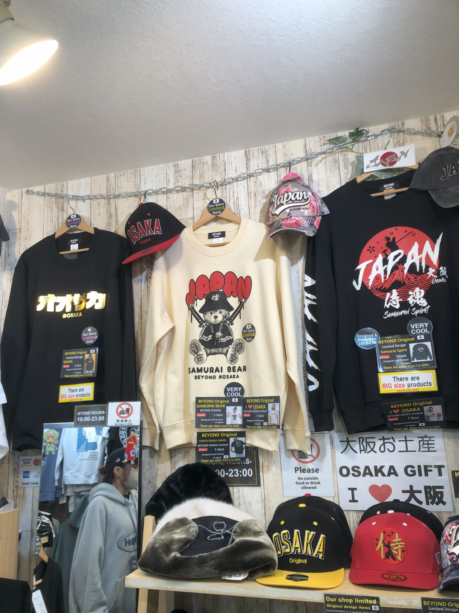
Japan is well known for its symbolism and the legends that surround its unique forms, which include dragons, chrysanthemums, and cherry blossoms. These symbols are frequently tattooed, which brings us to our first topic: tattoos. Because Japanese tattoos express stories through their designs, they are distinctive. Tattoo being a way of transfering a meaning or conveying a message has been severely misunderstood in Japan as mostly yakuzas are the ones that would normally get inked. We wanted to reintroduce an already existing Japanese tattoo style known as the Wabori styles. Some examples of Wabori style would be Japanese koi fishes, samurais and dragons.
Product Idea:
Hence, we proposed to create a kinchaku (a traditional Japanese bag) with a traditional Irezumi print in a Wabori style to show how perhaps Japanese society could slowly embrace back the cultural arts of tattoos using a common and traditional Japanese item.
Torii Gates
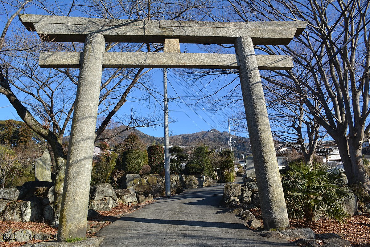
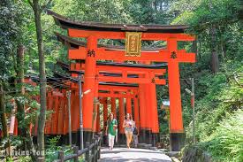
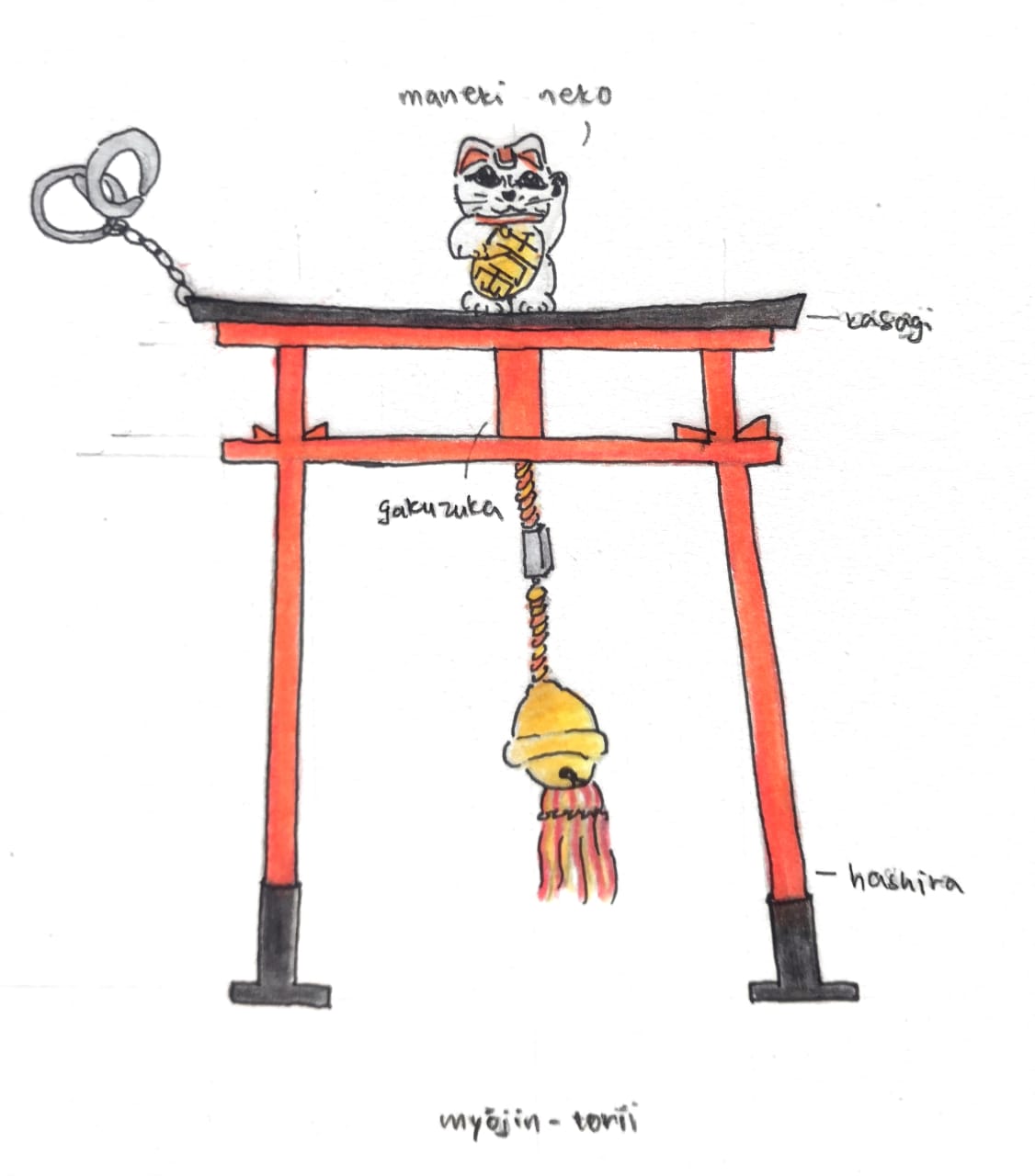
It is a fundamental aspect of Japanese society. Our second topic is Torii Gates, a construction typically found at the entrance to Shinto temples. The section on Japanese architecture that deals with torii gates includes some fascinating diagrams of each as well as a glossary of terms related to torii components. Torii gates are known as the entrance or the boundary between the human and sacred world. If the shrine passes an entire path of torii, increasing in number, this represents the increasing level of holiness as it inches closer to the core of the shrine. It is made of Japanese cypress wood and painted in a bright red color. Although most believes that the original color of the Torii gates were red, the white tori gates are said to be original colors representing purity which wards off evil. Red in Japanese is often seen as good luck and prosperity which is similar to the Chinese culture. However, in other countries, red is portrayed in a negative manner such as a sign of danger or warnings.
Product Idea:
A lucky charm torii gate keychain to be carried around holding the same original meaning to ward off evil spirits, bring good luck and prosperity.
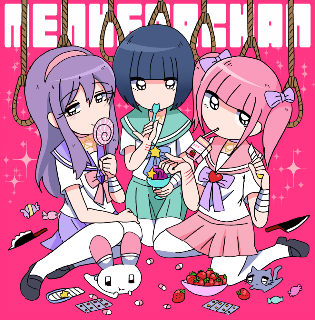
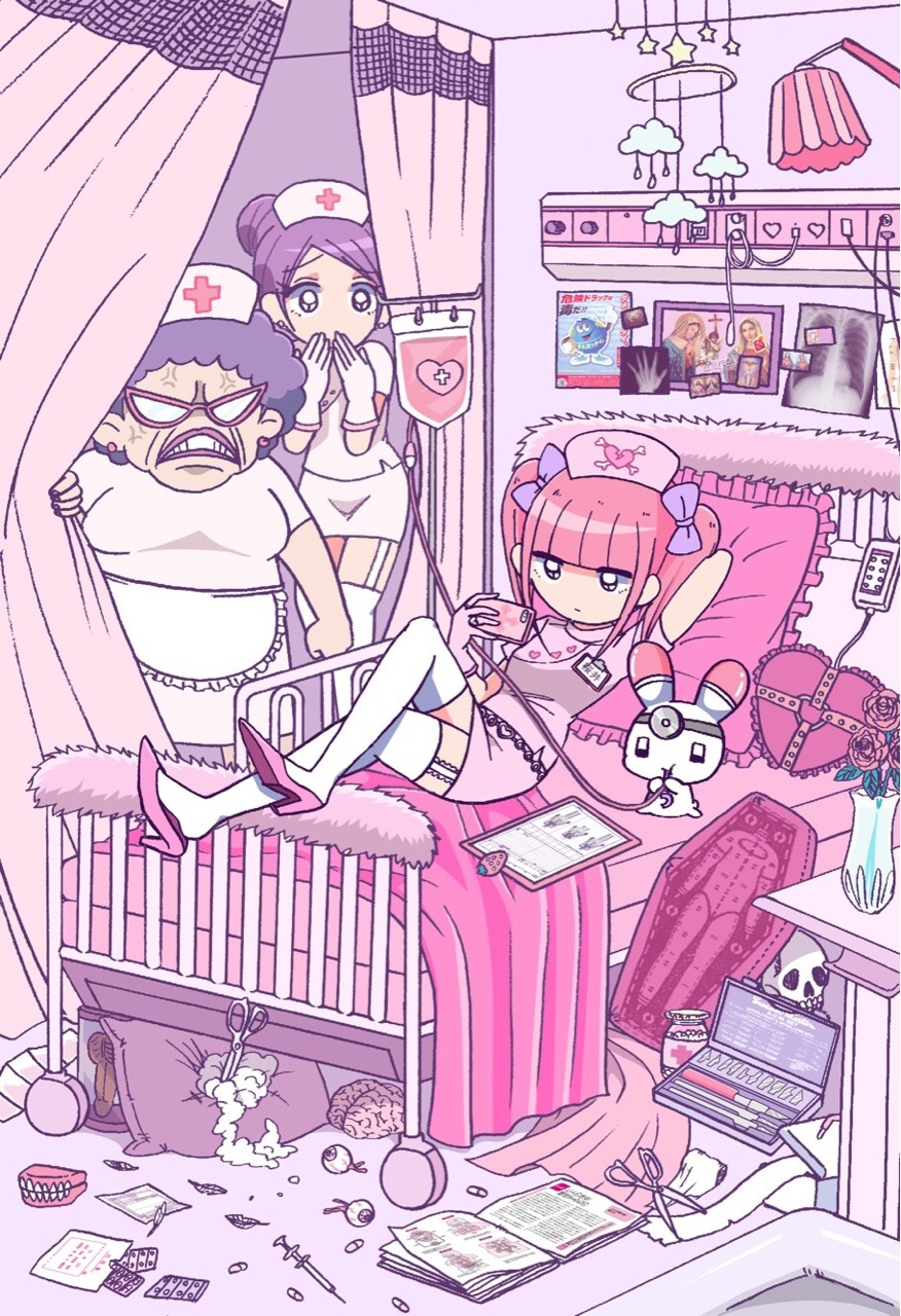
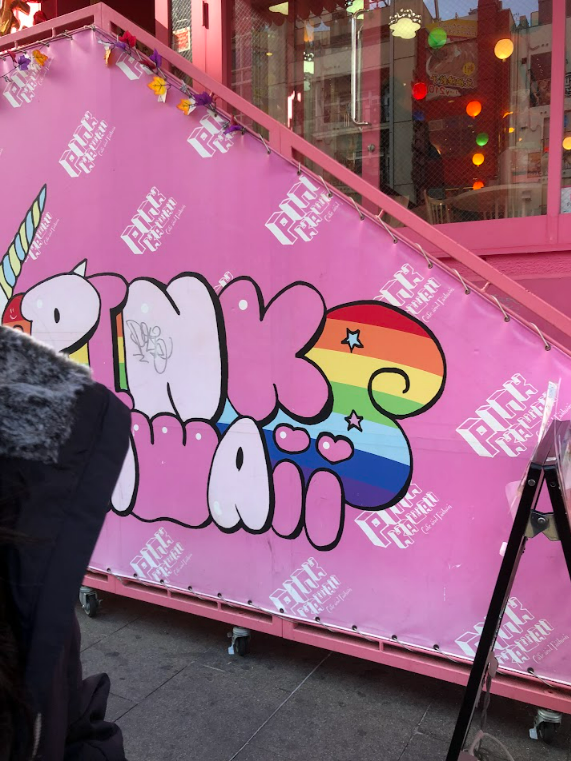
Yami Kawaii Aesthetic
For our last chosen topic: Yami Kawaii which directly translates to ‘sickly cute’, a fashion trend that helps young people in Japan to communicate feelings that they would otherwise be unable to voice. Yami Kawaii surfaced during the 2000s but didn’t have it’s own name till 2015. Yami Kawaii is an aesthetic that resides in Japanese fashion and is no stranger to the popular fashion district Harajuku, Tokyo. Yami Kawaii discusses and provides a platform for some to bring awareness to mental illness and depression, which is considered a taboo topic in Japan. “I want to change the negative image of mental health issues. And I think it is doing that. It uses those negative feelings that everybody has, whether it be some darkness or sadness, and makes it cute.” (Bisuko, 10:33, 2018)
Product Idea:
Graphic Tees. We decided on graphic tees as the main media for this draft as it is a unisex clothing item that can be enjoyed by both genders. With the rise of streetwear, t-shirt designs with minimal front logos and exaggerated graphics on the back have started to become popular among physical clothing stores as well.
FINAL APPROVED IDEA:
YAMI KAWAII AESTHETIC
Since there are a lot of design districts in Osaka that we can visit for inspiration and because graphic t-shirts are a popular item of unisex clothing among teenagers and young adults, we would be more inclined to choose Yami Kawaii as our major topic. What draws many people's attention to it is that it also highlights important topics in its motifs. Because mental health concerns are taboo in Japan, it raises awareness of the country's mental health difficulties because Japanese people rarely talk about them honestly. Yami Kawaii is shedding awareness on a significant issue while also giving children a platform to express their emotions, be authentic, and know they are not alone.
Project 2: FIELD STUDY
Data Collection:
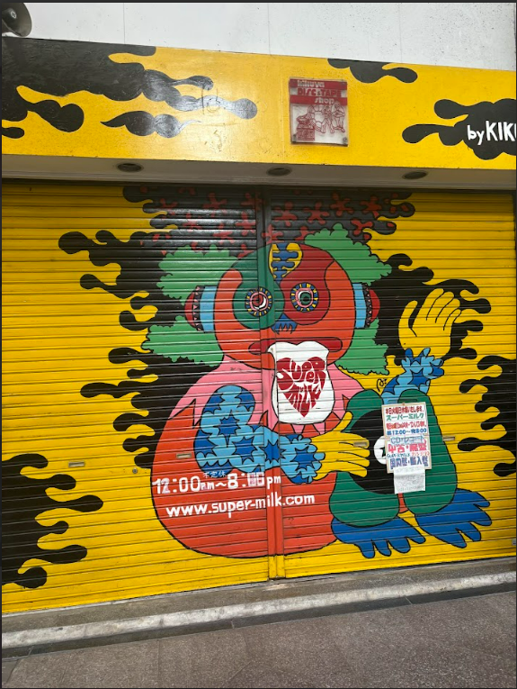
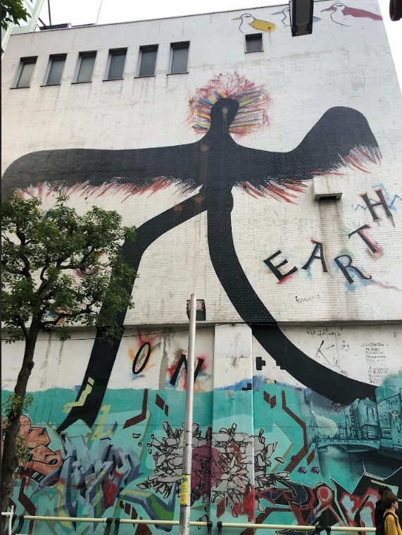
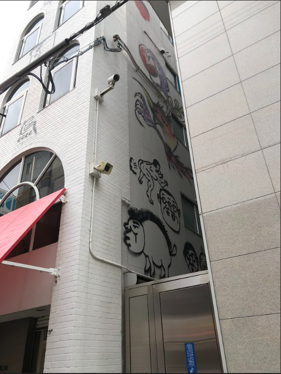
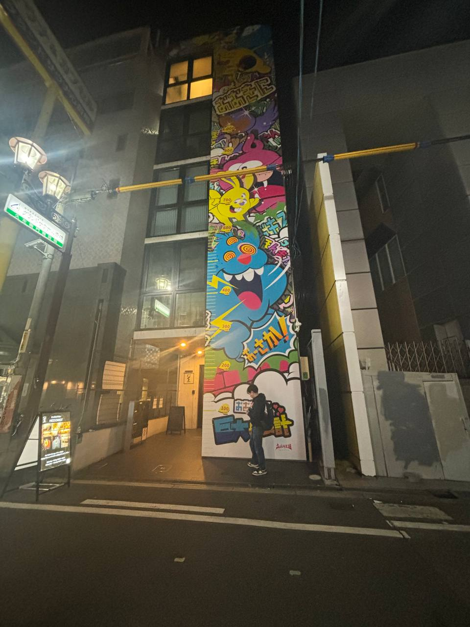
In Week 4, we were given the green light for our chosen topic Yami Kawaii and had proceeded to conduct research on the streets of Japan. As we were on the streets of Osaka, we roamed around Dotonbori Street in search for visual art/ street art that resembled our research.
We had come across a few visual arts such as:
Stores decorated in the Kawaii aesthetic.
Street art.
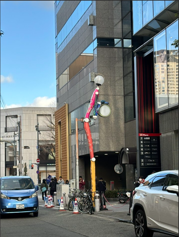
Decorated lamp post.
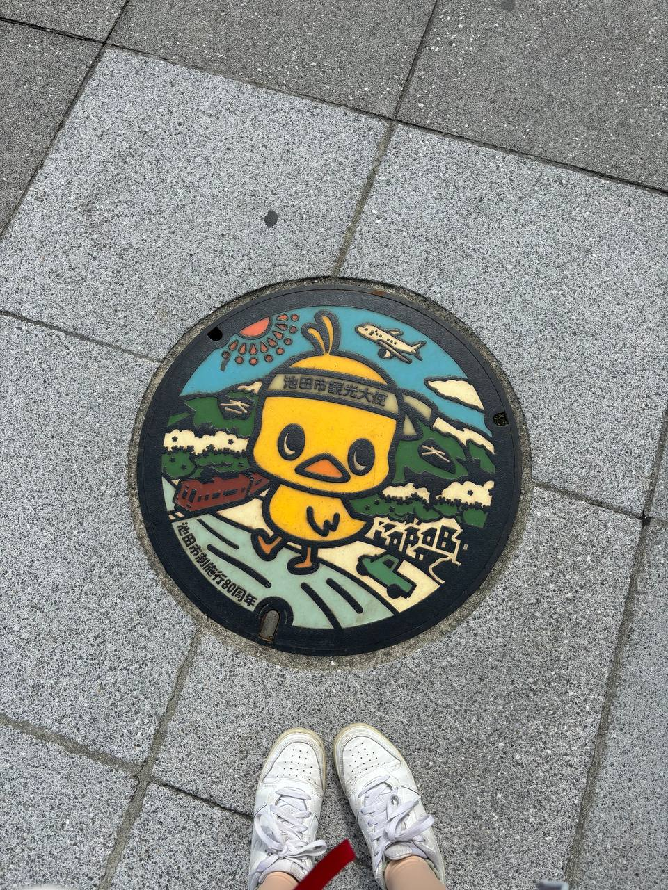
Manhole covers.
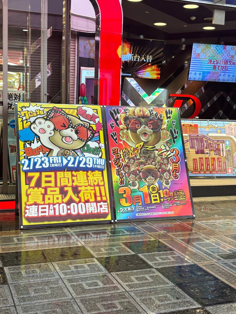
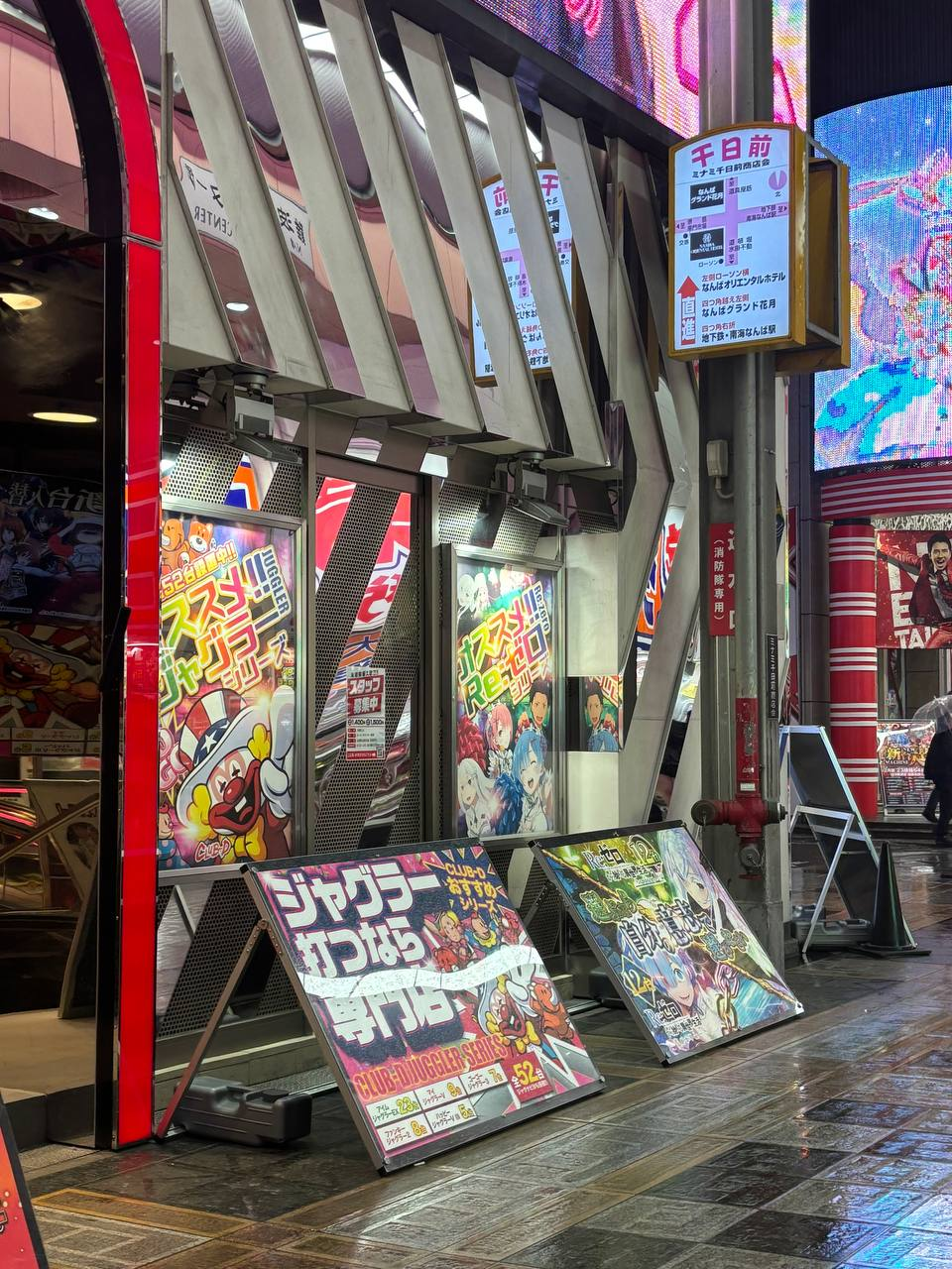
Arcades merged with Graphic Design.
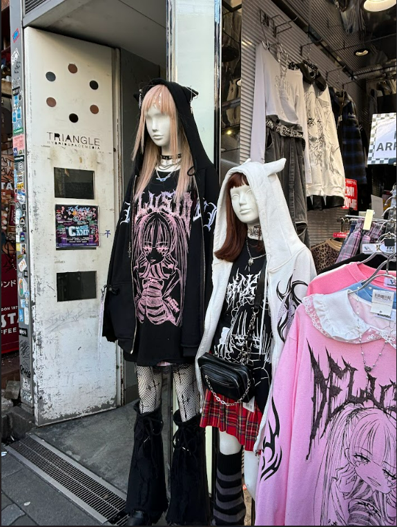
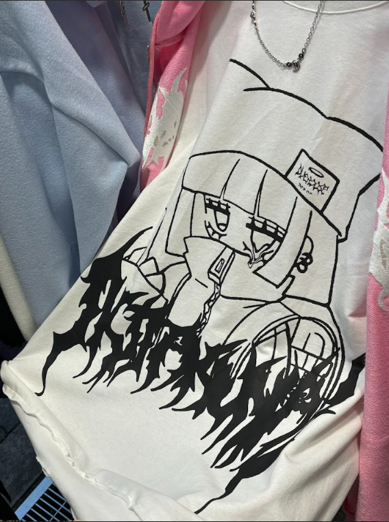
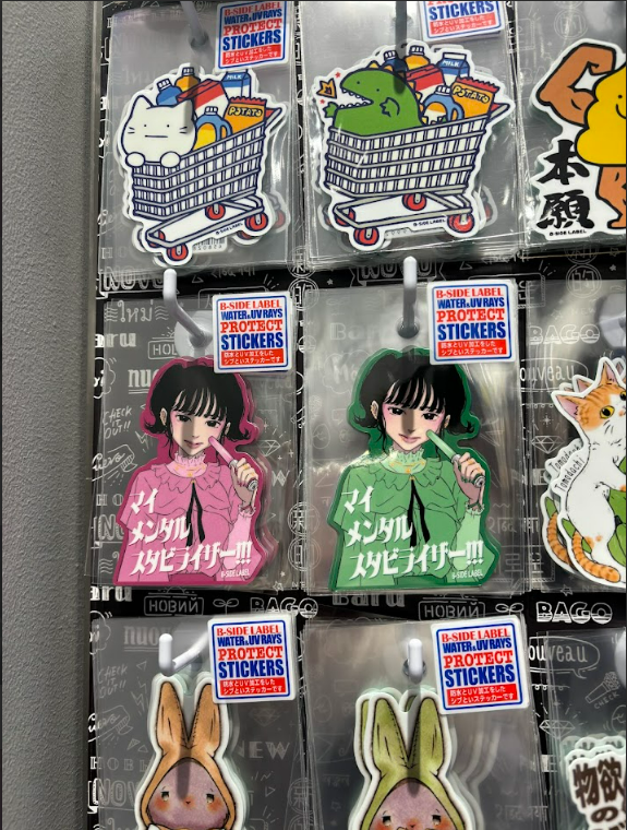
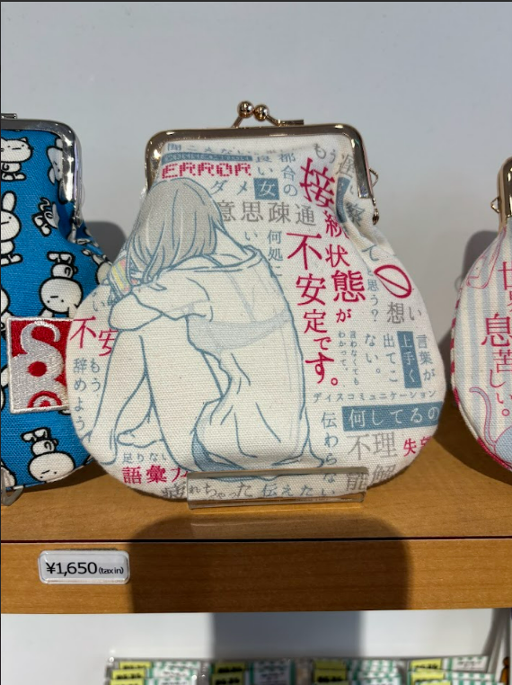
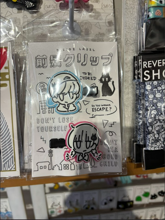
We had also came across with several merch stores selling accessories, merchandise and fashion items. It was really inspiring and interresting to look at. There were many customers that dressed up in similar aesthetic but we weren't able to get consent to take a picture as they were shy. These are some of the merch and clothes that we managed to come across with.
Yami Kawaii aesthetic reciding in the streets of Osaka.
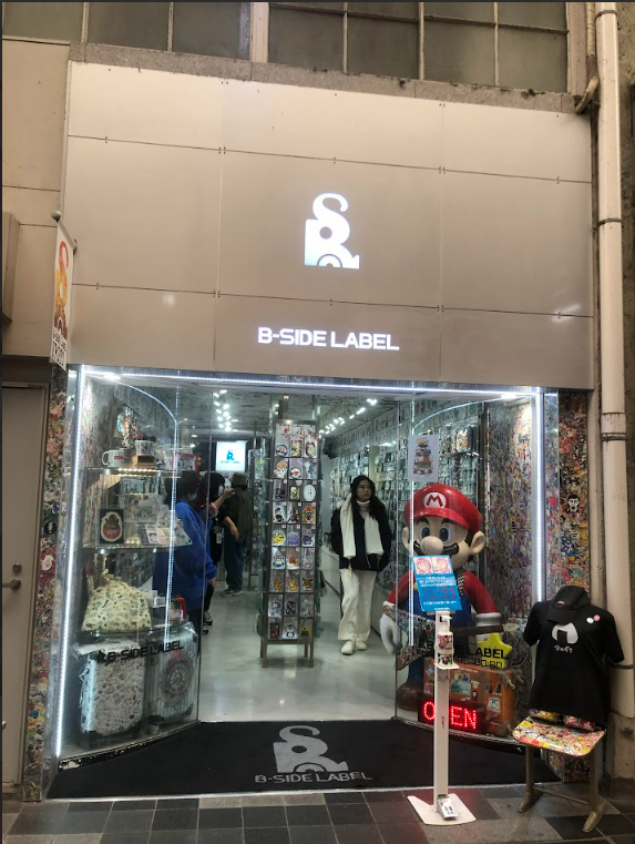
We found a store named B-Side Label that had a few storefronts in Osaka, they sold some of their own merchandise but also sold some anime merchandise. The pictures above were some we could find.
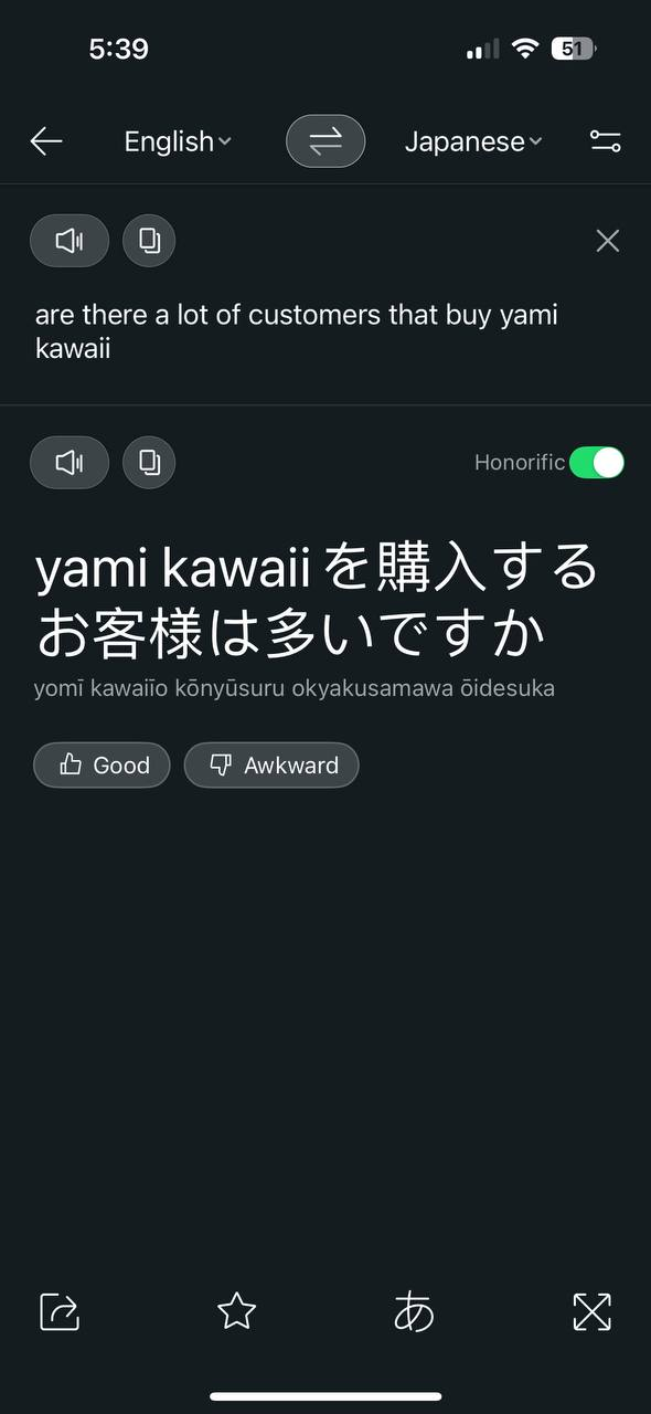
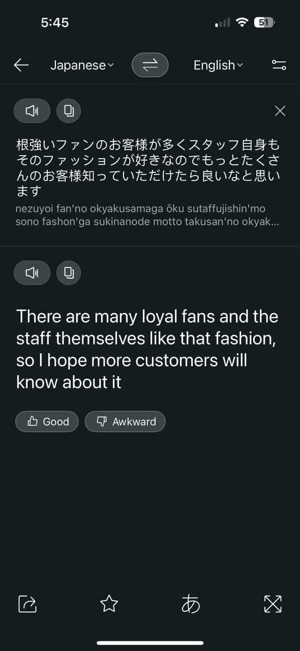
B-side label was the first store we went into and using a translator app, we asked the store assistant about the customers that purchase this aesthetic, and he says that many do. The B-Side Label we entered was located in America-mura, which we actually found because a kind clothing store owner we asked about had pointed us in this direction.
Questions: Are there alot of customers that buy Yami Kawaii? What do you think about it?
Response:
We also asked a few shop keepers about the frequency of people who purchase these items and they say that many people do.
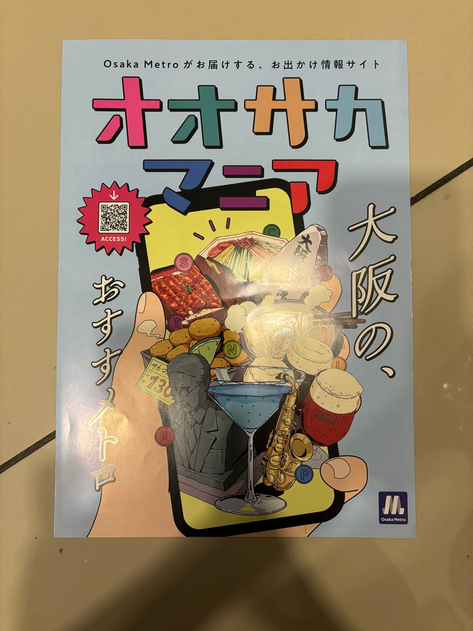
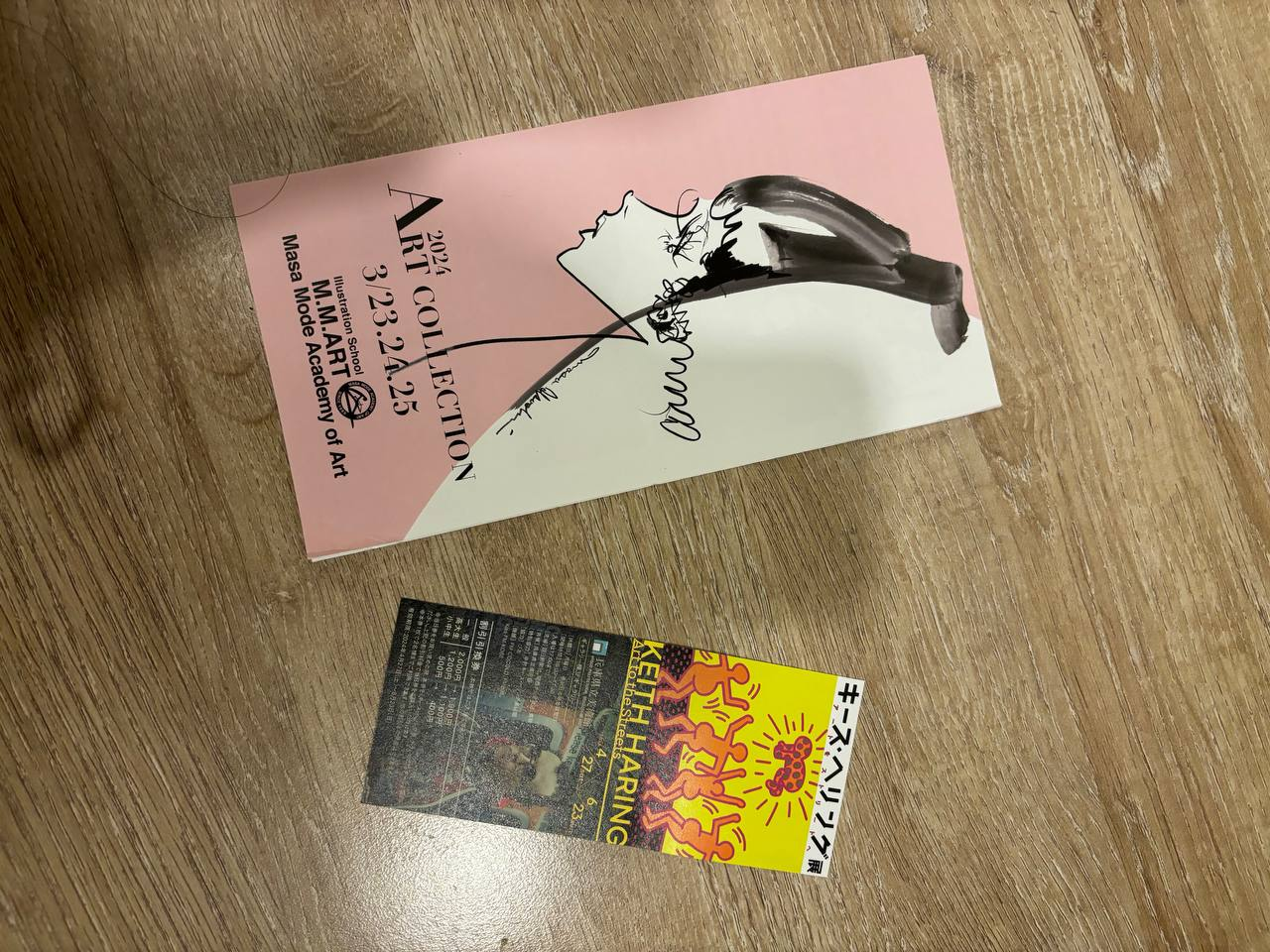
We ended up picking up a bunch of flyers we found at the metro stations as we were really drawn to how they managed to make adverts, maps and various notices so eye catching and attention grabbing.
The illustrative graphic designs gave us a different approach and inspiration to further our research that would imply on our final designs four our graphic tees.
Final Assessment: FINAL PROJECT & PORTFOLIO
MAIN CONCEPT RATIONALE WITH GRAPHIC TEE RATIONALE:
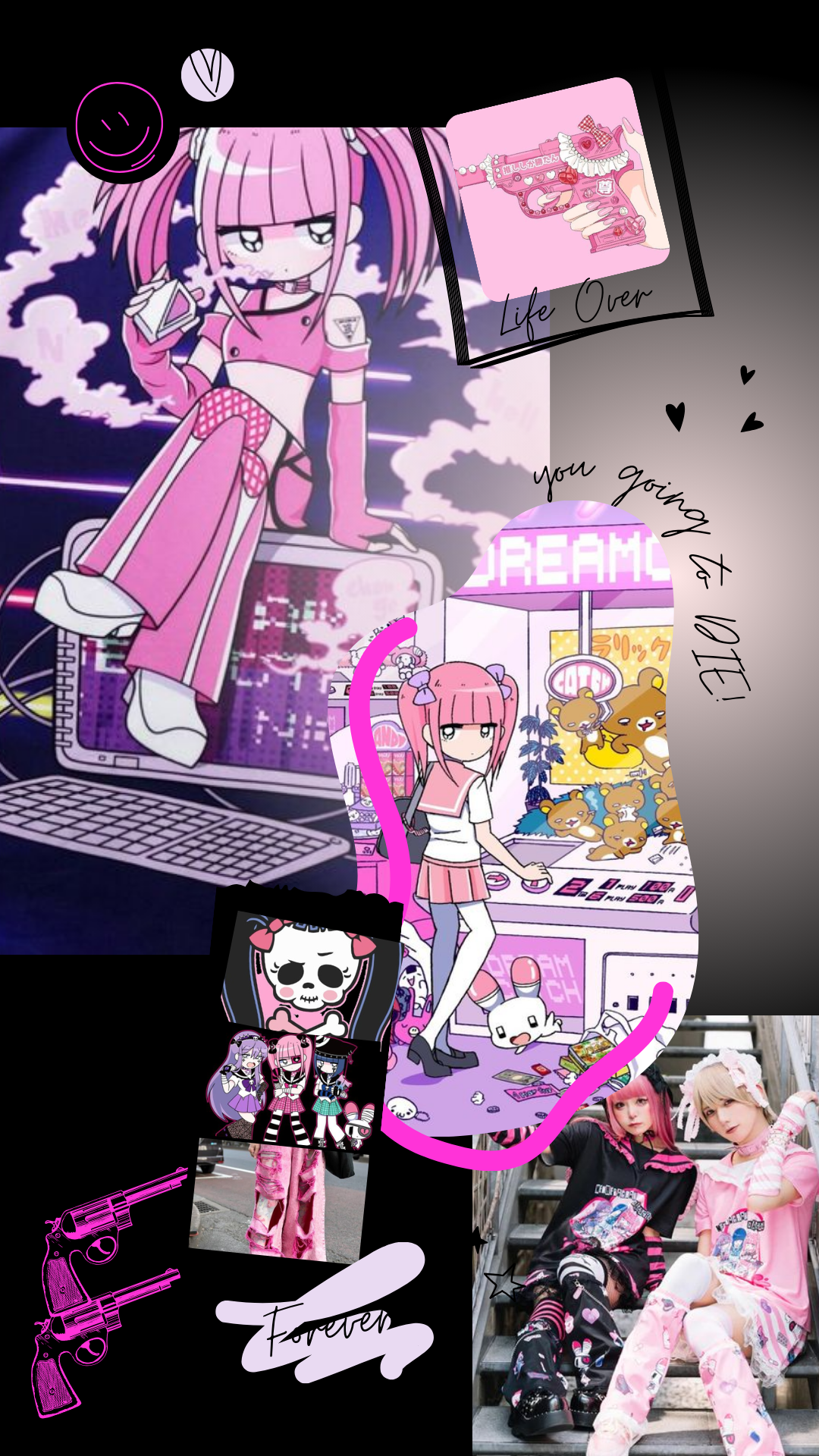
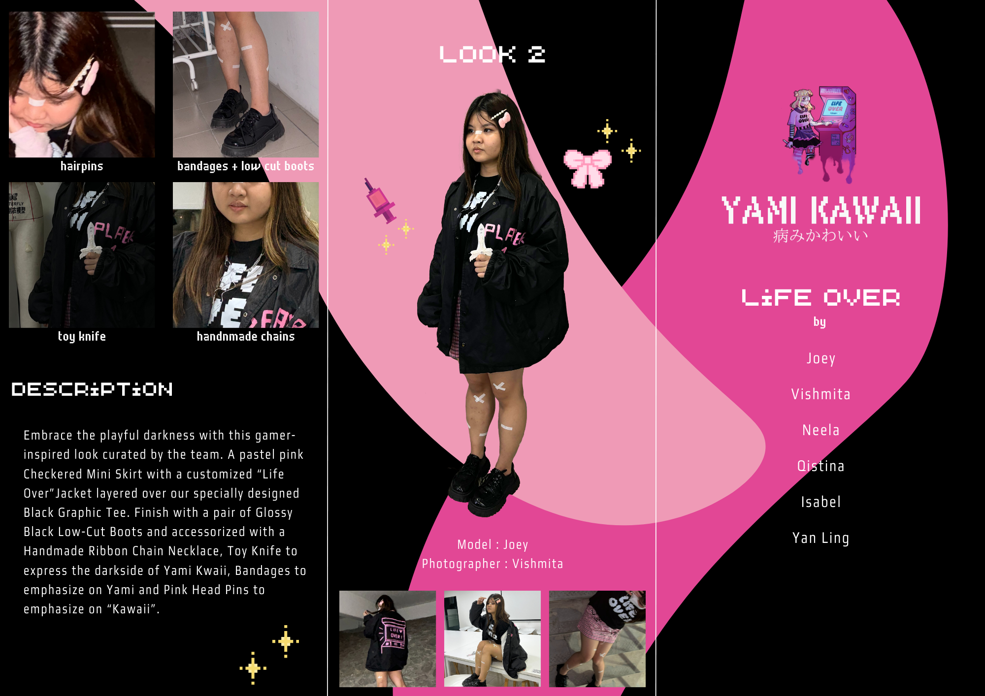
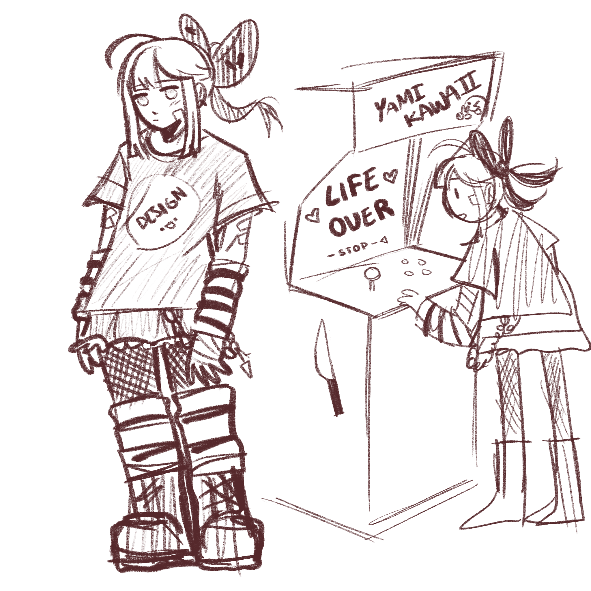
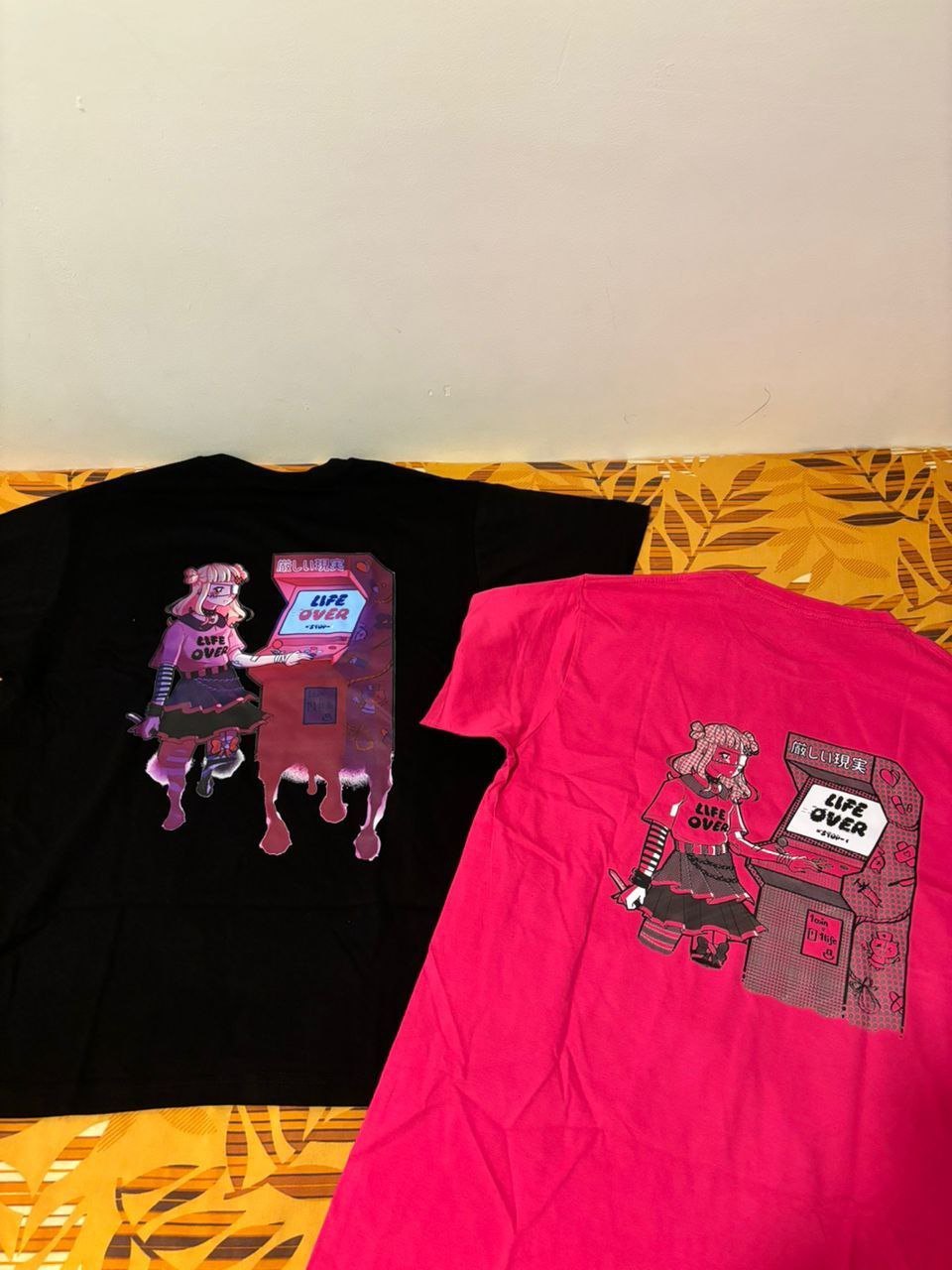
The anime art style that is regularly displayed at the arcades in the Dotonbori area served as our source of inspiration. That being said, "LIFE OVER" will be the title of our main project. Instead of calling it "game over," we chose the title "life over" because, in most video games, there is a game over screen after you lose. Whereas it does away with the notion that one can "respawn," signifying the end of one's life.
We made the decision to have our design be two-sided, with the "Life Over" logo on the front and an illustration of a girl playing an arcade game on the back. When the girl loses the game, the screen of the arcade machine reads "LIFE OVER," and her only choice is to "stop" living.
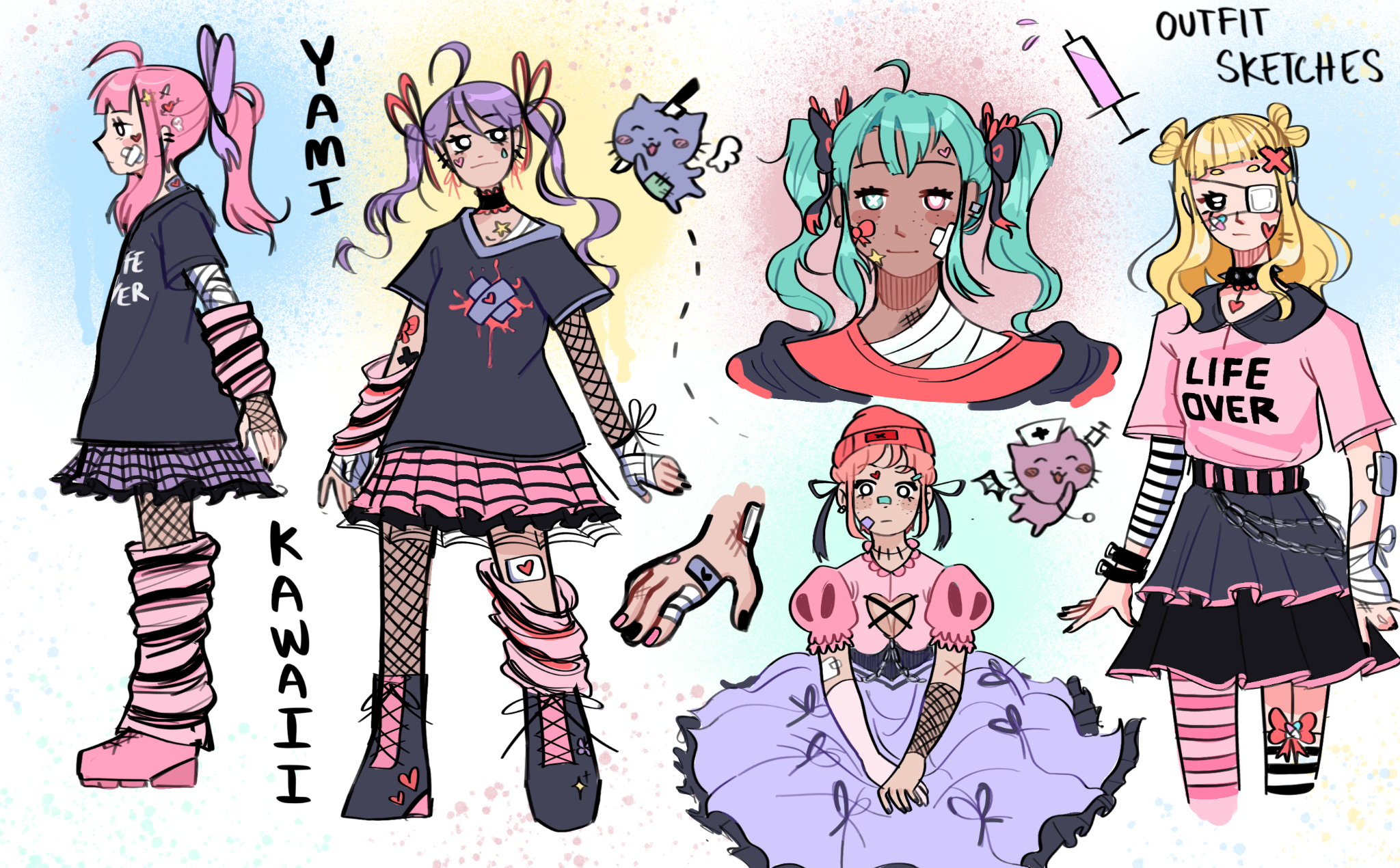
Initially, we drew potential concepts for the character in our graphic shirt design. As you can see, there is an aspect of an injury or bandages in every sketch. These nuances, nevertheless, are subtle enough to cause viewers to focus on the adorable outfits and hairdo before noticing the sinister aspects. In addition, the blacks and dark greys are mixed with pastel and light colors to create contrast with the adorable coloring scheme.
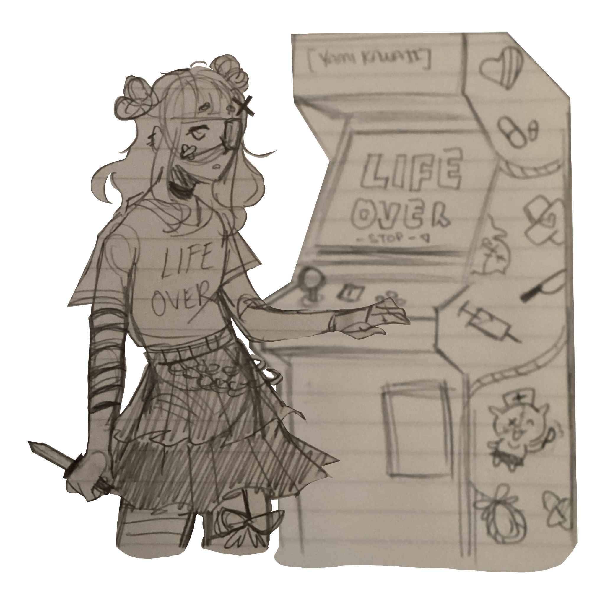
This is the final mock-up sketch design we had chosen to print on our T-shirts.
During the process of the lineart, the “Yami Kawaii” sign from the previous sketches was changed to “厳しい現実” which roughly translates to “harsh reality”. This change makes it as if the girl is playing a “harsh game of life” in which, as seen from the arcade screen, she loses her life. Her expression is lost, unsure of what to think.
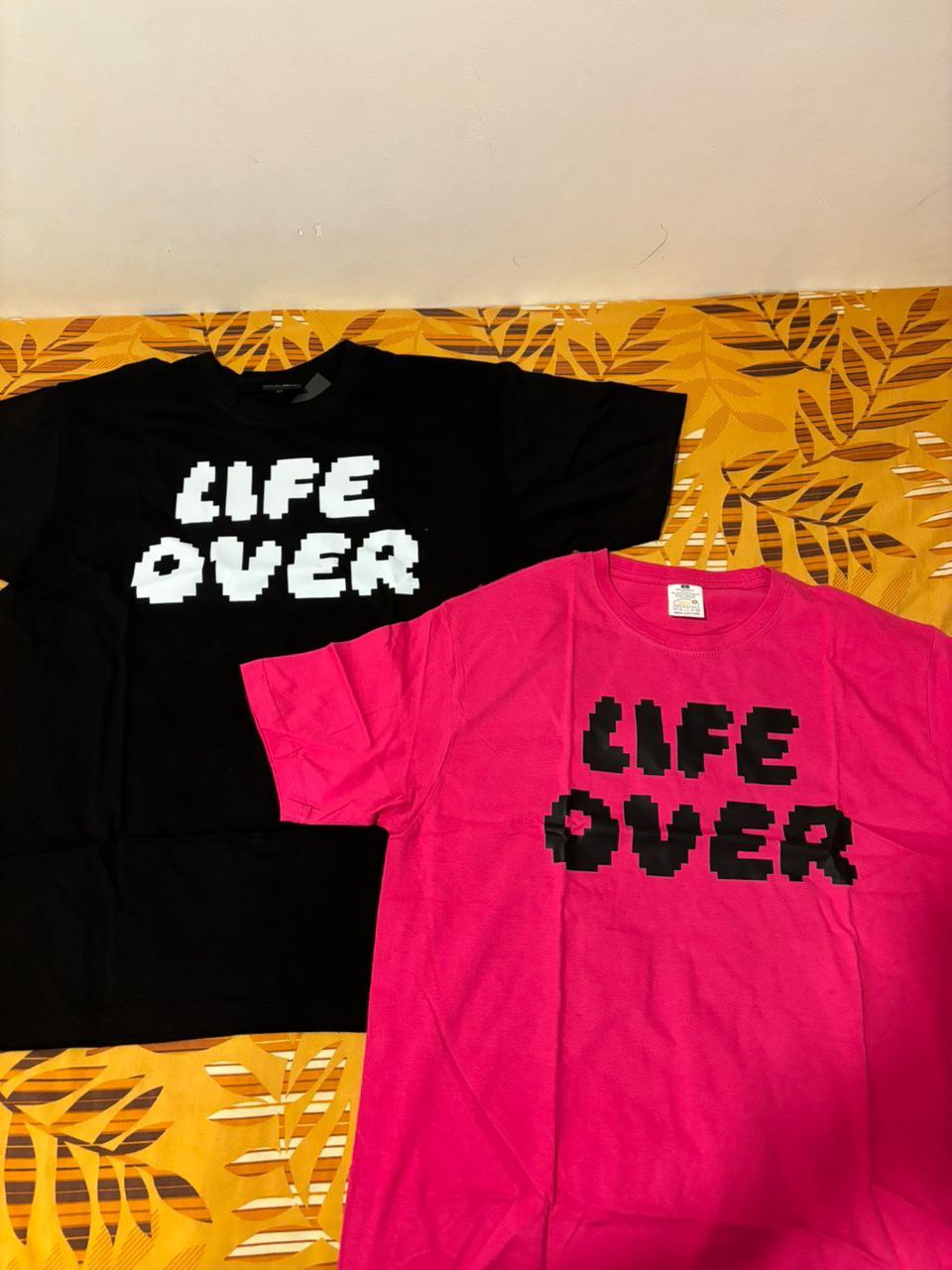
Graphic Tees :
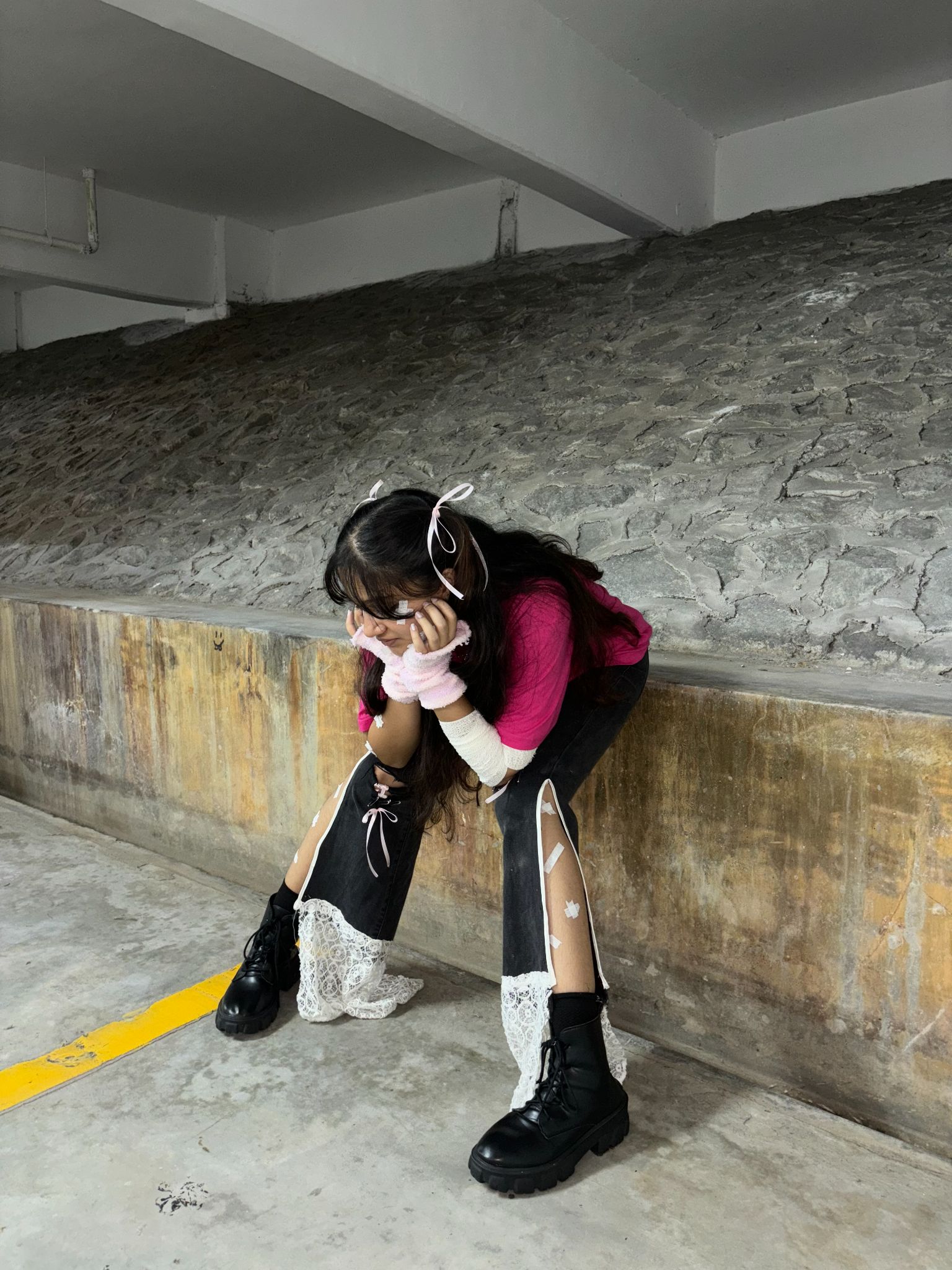
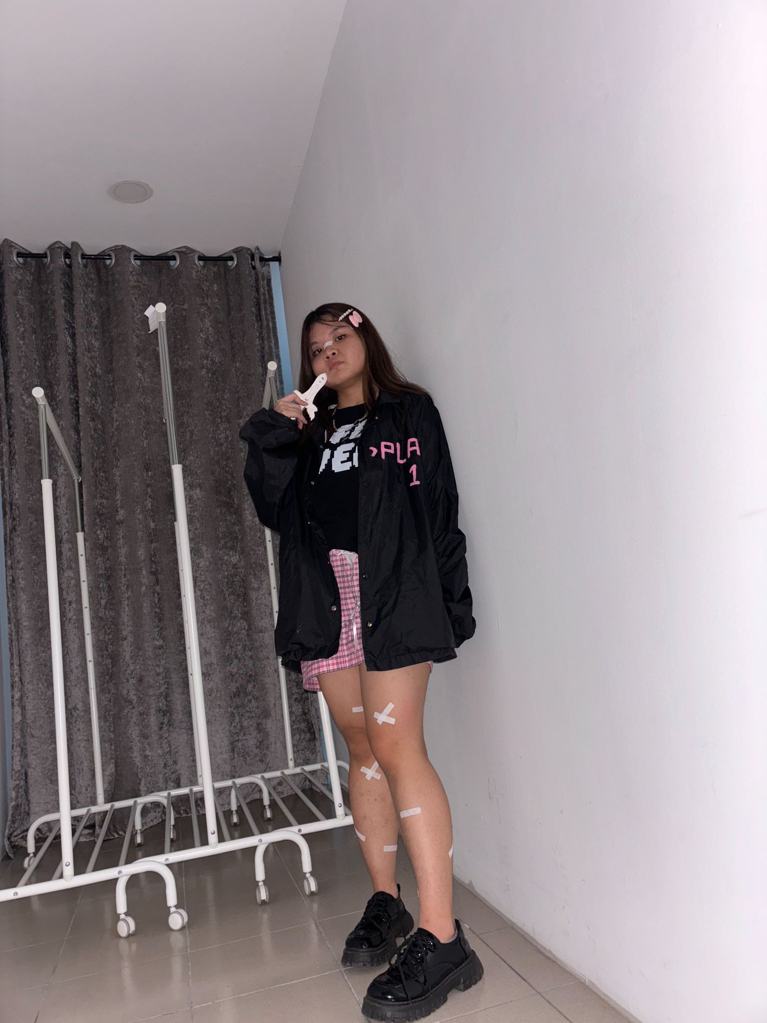
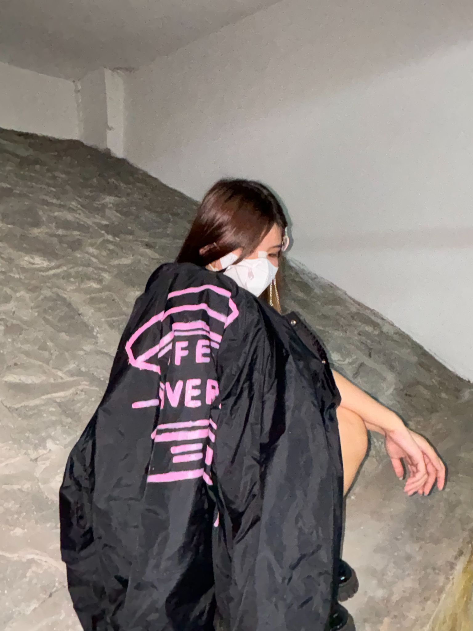
Modelling with accessories: 
Accessories include:
- toy gun
- toy knife
- hand warmers
- hair accessories (ribbons & clips)
- bandages on face, legs and hands
- pencil skirt with LIFE OVER scribbled on
- wind breaker jacket with a video game with the wordings LIFE OVER
- reworked jeans with safety pins and ribbons
- Graphic Tees
LOOKBOOK:

FRONT
 BACK
BACK
MOODBOARD:


Comments
Post a Comment